Care Squared Connect
Under the Humanity Health Group umbrella, Care Squared Connect (C2C) sat alongside its parent brand Care Squared but lacked a distinct visual identity, using the same colours and fonts. The brand needed to connect with NDIS participants under 30 and build enthusiasm for the many programs C2C delivers.
I wanted to create a design system that allowed flexibility and growth for the future. I started with the heart icon that was already being used for one of the C2C Programs and I focussed on creating three more icons that would represent our tagline – “fun, social, active, creative”. I added the yellow as a secondary colour to distinguish C2C from the other Care Squared brands, as the others had different colour palettes but C2C did not. The yellow is bold and it pops, contrasting nicely with the teal. A secondary font was also added for our brand collateral to give a more casual and less corporate feel.
The C2C Programs also needed to be branded. I made sure all the colours worked together and created icons that all worked similarly. Each icon is made up of two shapes that overlap and one of the shapes is large enough for an image.
RESPONSIBILITIES
Concept development
Design and development of printed collateral
Liaising with printers
Social media campaign design
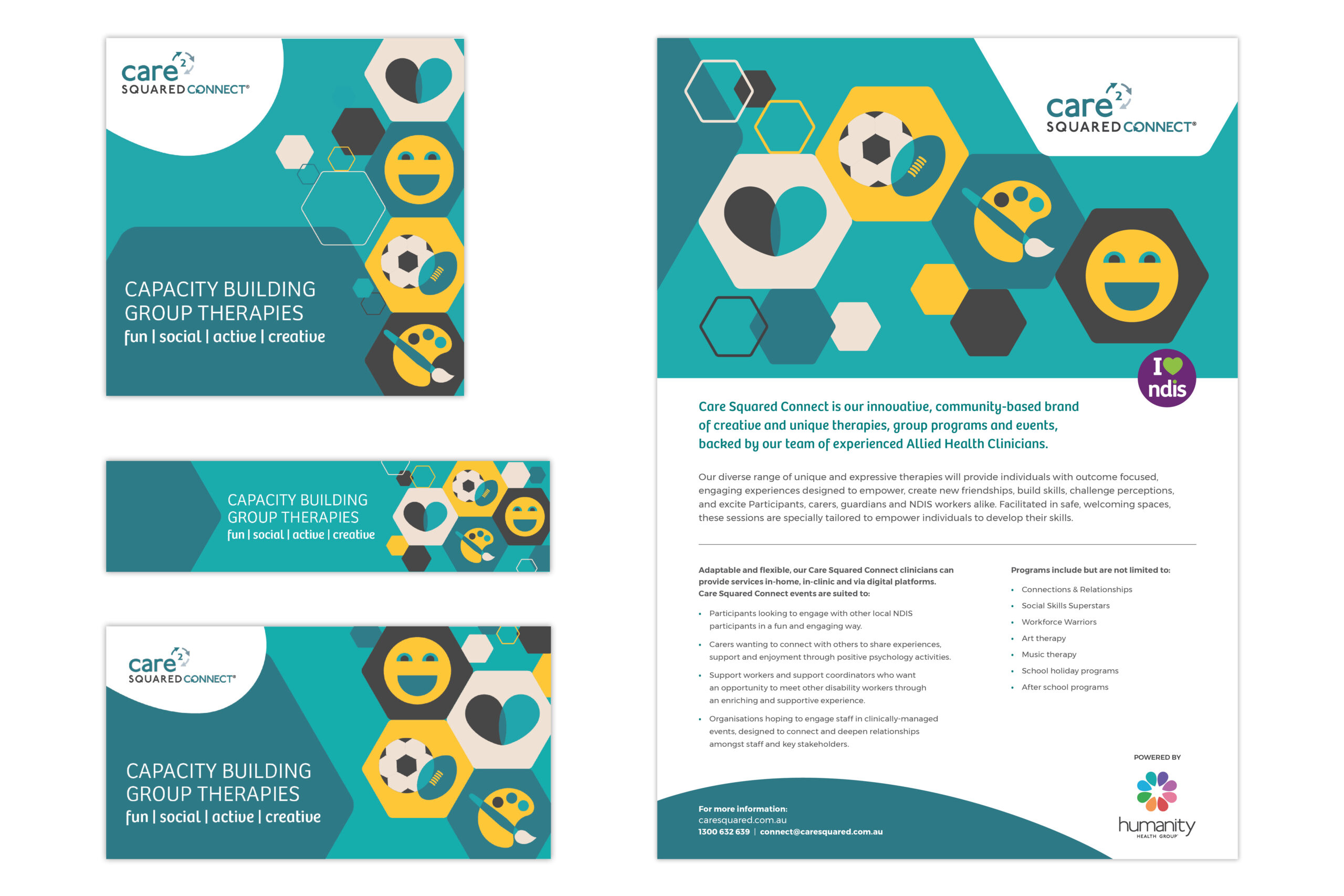
Rebrand Socials, LinkedIn Banner and Flyer.
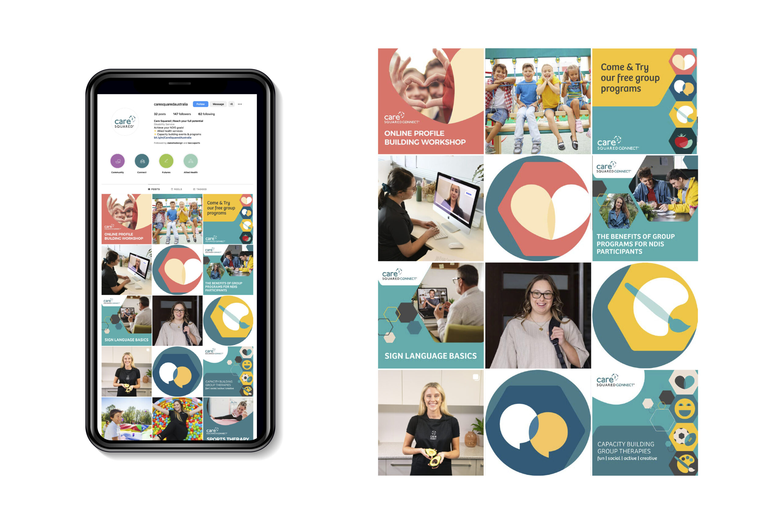
Instagram feed.
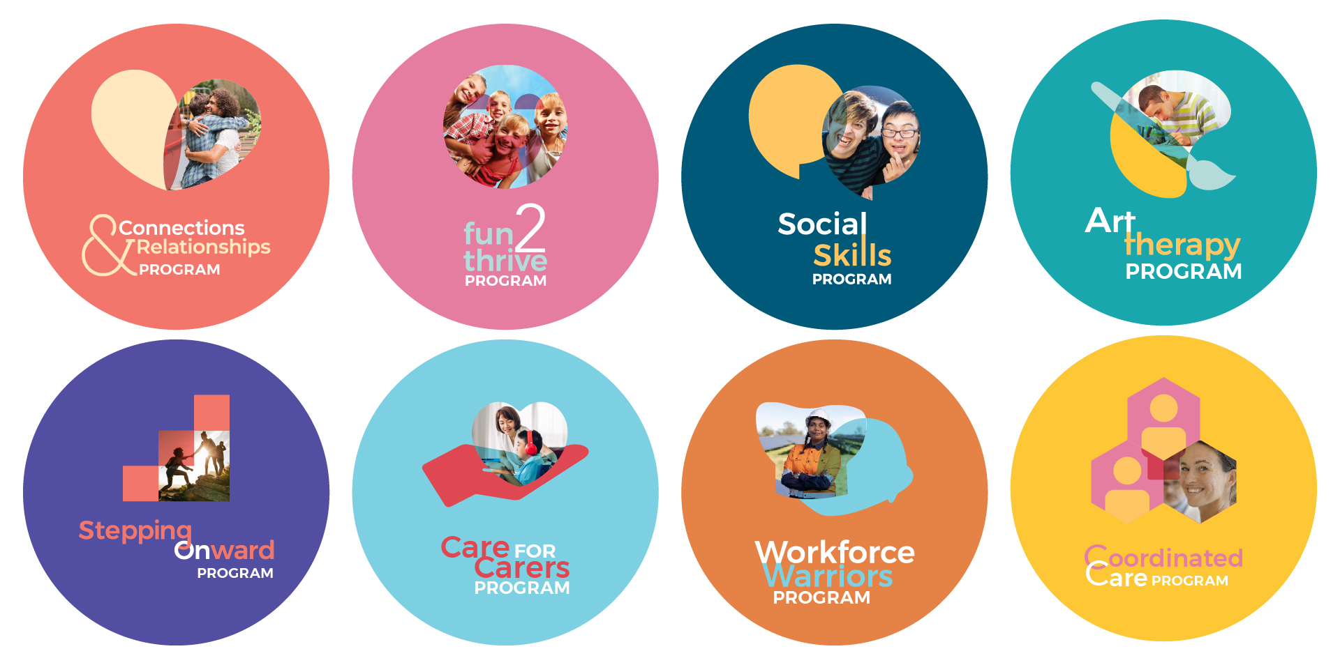
New program branding.
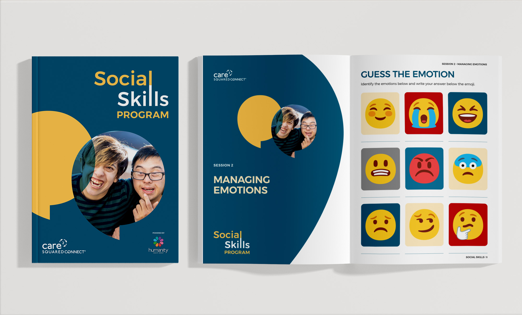
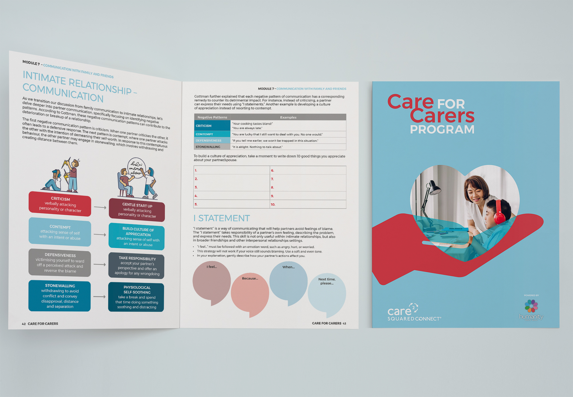
Program workbooks.
RELATED PROJECTS
Videos and animation
Trilogy Care